Pivoting Like a Pro: When Glassmorphism Had to Go
- Written By Rich C. Jacobs

- Mar 4, 2025
- 1 min read
Sometimes, you gotta pivot. And that’s exactly what I did.
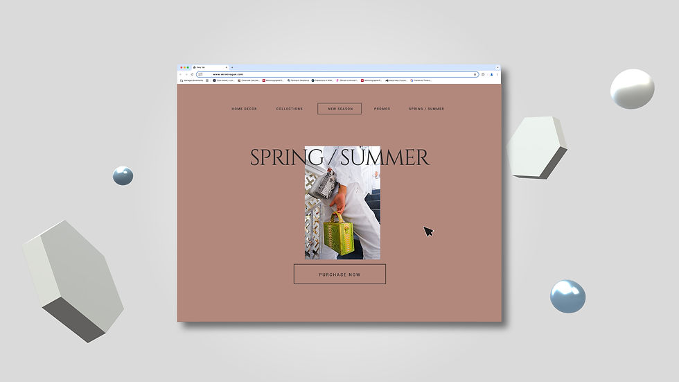
The Glassmorphism look was coming together real nice—it had that sleek, futuristic feel. But then reality hit me… fine-tuning it AND making sure the graphics inside the glass looked real? Yeah, that was gonna take way too much time for this project. So, I pivoted.
I took out the Glassmorphism effect, but here’s the cool part: I had already spent a ton of time crafting a solid background. So when I removed the glass and kept my graphics, guess what? It STILL looked clean. The motion graphics are about to be 🔥🔥🔥, and the overall look is coming together even better than expected.
And guess what? The Art Director wanted to scrap the shapes too! 🤯
That’s when I realized—sometimes, you just gotta go with the flow and not be too attached to the art. The key? Get feedback early. If the Art Director is feeling it, you’re in the clear. If not, better to know before you spend hours fine-tuning something that’s getting cut.
But hey, I learned a lot from working on these graphics, and now?
🔥 It’s time to make this bad boi DANCE. 🔥
Here’s a look at how it started… where it went, & where it lands.


Comments